I just completed a Flexbox crash course by Brad Traversy:
Flexbox is a CSS layout model designed for creative responsive web layouts. It gives you control over alignment, spacing and distribution.
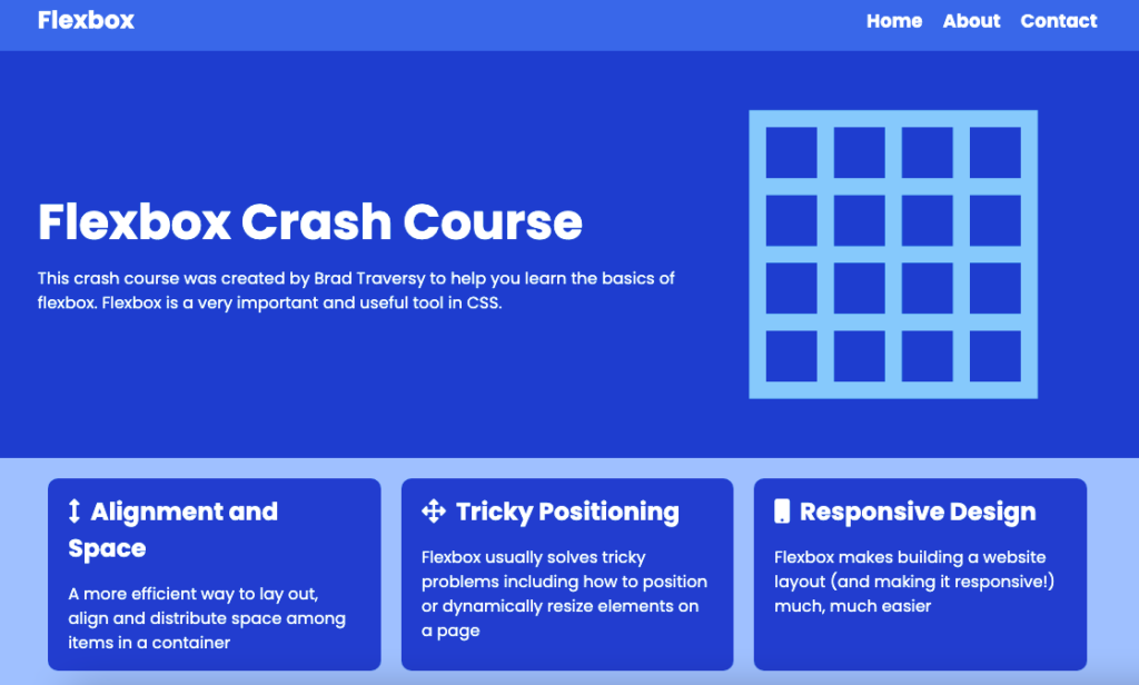
In his video Brad introduces you to the basic concepts of Flexbox, then puts it to practical use to create a webpage:

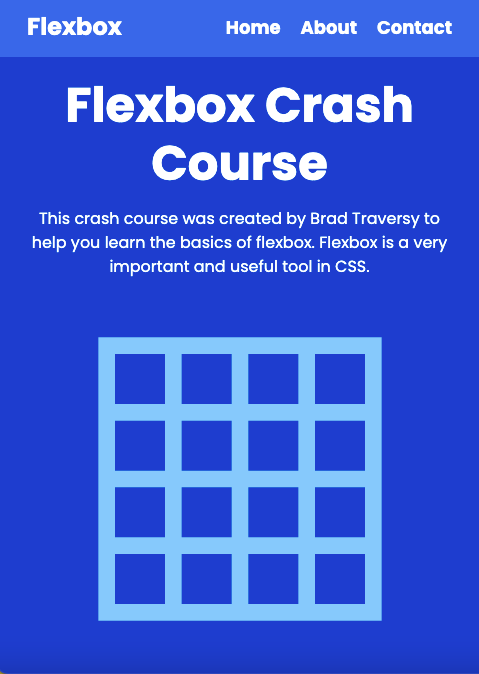
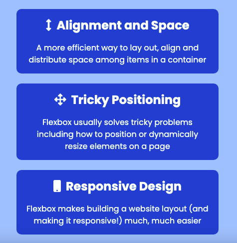
This webpage is also responsive. With Flexbox, you can change the position of elements based on screen size:


Flexbox is one method to structure a webpage. Another option is CSS Grid. Both have their strengths and weaknesses. Flexbox is good for one-dimensional layouts (either rows or columns). Grid is good for two-dimensional layouts (rows and columns simultaneously). You can use either to create a webpage layout—or even combine them for greater flexibility.