I am doing HTML and CSS course on Scrimba.
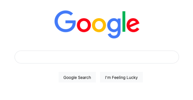
One interesting exercise in this course was to create a duplicate Google page using HTML and CSS:

What did I learn from this exercise?
Websites can be simple…
In this duplicate page, you can see that the Google page contains only four elements: the logo, the search bar, and two buttons. Yet the page still looks professional. In most cases, simplicity is the key when it comes to designing a webpage.
…but they also can be complicated
Although the webpage looks simple on the surface, it gets more complex when you dig into the code.
Yes, there are only four elements on this page.
But they need to be styled.
And this styling is done with CSS code (which you can insert into the HTML document, or create as a seperate sheet). In this CSS code, each element has several parameters that you can adjust, such as border size, height, padding, margins, colouring, etc. And each small change can have a significant effect on the appearance of the webpage.
Some changes can be detrimental:
Sometimes if you make a simple adjustment to one element of the webpage, it can have a detrimental effect on the whole page.
As an example, I will show you the Google search buttons:

Can you see the issue with this?
Well, in the code I adjusted the padding from 16px to 32px, and this is what caused the buttons to move from the centre to the right.
button {
    box-sizing: border-box;
    margin-top: 0;
    padding: 0 16px;
    font-size: 14px;
    height: 36px;
    background-color: #f8f9fa;
    border: 1px solid #f8f9fa;
    cursor: pointer;
}
button {
    box-sizing: border-box;
    margin-top: 0;
    padding: 0 32px;
    font-size: 14px;
    height: 36px;
    background-color: #f8f9fa;
    border: 1px solid #f8f9fa;
    cursor: pointer;
}
Why did this happen?
Admittedly I’m not sure.
Maybe it can be fixed up by adjusting other CSS properties.
But I found a different solution.
In order to centre the buttons I created a flex container, which allows you to specify that the content is to be displayed in the centre:
.container {
    display: flex;
    justify-content:center;
    margin-top:20px;
}
<div class="container">
<button>Google Search</button>
<button>I'm Feeling Lucky</button>
</div>
Now, the buttons are aligned in the centre no matter what reasonable value I put in the padding.
Another thing: Small errors in coding can disrupt the whole webpage
While I was trying to find a solution to the previous problem, I put in the code.
Instead of aligning to the centre, the buttons moved to the left!
Can you see the error in the code?
.container {
    display: flex;
    justify-content:centre;
    margin-top:20px;
}
I made the simple error of writing “centre” instead of “center” so the browser did not recognise it.
Spelling is crucial when it comes to coding.
An incorrectly spelled keyword, a missing character and even a missing semi-colon can disrupt the whole webpage.
Conclusion
Coding contains complexities (which is why you can do so much with it).
Coding must be dead accurate.
Good web design is simple.